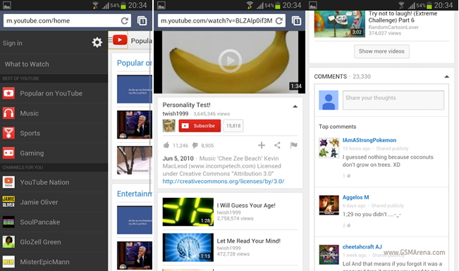
If there’s one thing that persisted from Palm’s Web OS, it’s the
“cards” feature that was so highly touted, and praised, from the now
dead operating system.

It seems like Google is testing a cards-centric approach to their mobile YouTube web application. Big G is also playing with the idea of adding in a slide-out side drawer.
This effectively makes YouTube’s mobile web site nearly identical to the YouTube app found on Android phones.
It definitely makes for a marked improvement. The pages look cleaner, making browsing for videos a much more pleasurable process.
Source | Via
No comments:
Post a Comment