A few days ago, Facebook announced
their new mobile app called Paper. Paper combines your regular Facebook
feed along with news from different sources in a radical new design
that is a complete departure from anything Facebook has ever made. The
app is now available for download for free on the iPhone in the US.

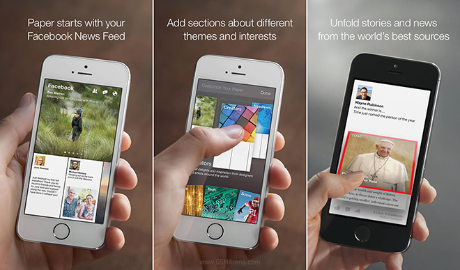
Paper is that new Facebook app that you always wanted but it does more than just give you a new design. The developers have found a way to also incorporate news from different sources, similar to the Flipboard app. You can add categories you want to get posts from and you’ll get a curated list of content that fits the bill. Click on a post you want to read and it flips open like a newspaper. If you just want to go through your Facebook feed, you can do that as well.
The UI has been radically redesigned and looks nothing like the standard Facebook app. You have horizontal scrolling UI with large cards at the bottom that you can swipe through. Tap on one and it slides up to fill the screen. You can then continue to scroll horizontally through the opened post and see all your Facebook posts full screen, similar to how they looked on Facebook Home on Android. If you open a photo, you can tilt the device side by side to pan through it. You can Like, comment or share them as you would on the standard Facebook app. There is even Facebook Messenger built-into it. Make no mistake, this is still the full Facebook experience, just with some new stuff added alongside.
The Paper app is a major departure from the standard Facebook app in terms of UI and UX, which is probably why Facebook isn’t replacing the latter with the former. It would be too much of a change for people who are now used to the standard app. But if you want to try something new, the Paper app is now available for download.
Unfortunately, as of now, the app has very limited availability, with just one device in one region being supported as of now. If you live in the US or have a US App Store account and an iPhone, you can give the Paper app a try by downloading it from the link below.
No comments:
Post a Comment