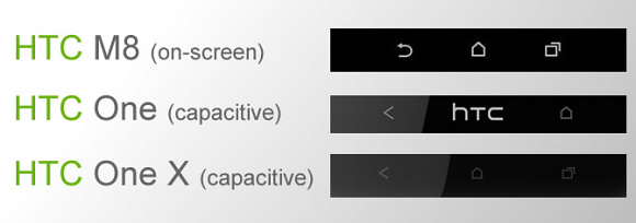
We've already heard that the successor to the HTC One - the M8 or Two - will have on-screen navigation buttons (instead of capacitive ones under the screen) and thanks to an anonymous email we may be seeing what they'll look like.
The image below shows the proposed three button configuration - the home and app switcher buttons match the current Sense design, the back button doesn't.

This could turn out just a well-made concept, not to mention that if the M8 launches with KitKat the on-screen buttons background should be transparent.
The image below shows the proposed three button configuration - the home and app switcher buttons match the current Sense design, the back button doesn't.

This could turn out just a well-made concept, not to mention that if the M8 launches with KitKat the on-screen buttons background should be transparent.
No comments:
Post a Comment