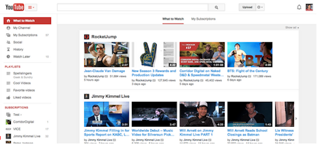
YouTube on Thursday announced it had made changes to its overall design, as well as the way people would manage and use playlists.
On the official YouTube blog, web developer Yining Zhao, writes, "The way you watch YouTube keeps changing so we are making a few tweaks to YouTube to keep up with you. Starting today you'll see some changes to make it easier to find what you want to watch on YouTube and collect playlists to watch again and again."
Under the new playlist revamp, the left side of the YouTube site will also have a dedicated Playlists window below the 'What to Watch' section, which will show users their favourite videos, and the channels they like. In addition, there will be a new guide that will have all the playlists created and playlists liked. If a user makes a playlist then there will be a new page that helps making the editing easier.
In addition to that, the blog states that there is a new look to the website too. The centre-aligned look, fits neatly on screens of any size, which is in sync with the YouTube mobile app, which the team at YouTube feels, is where users spend most of their time on. Zhao writes further, "One can quickly flip between what's recommended and popular in "What to Watch", and the latest from subscribed channels in "My Subscriptions," with both options now front and centre." A guide icon to the right of the YouTube logo can be clicked to access the playlists, subscriptions and the other new options.
The changes do not come as a big surprise given that there would be changes of this nature after Susan Wojcicki was appointed the new chief of YouTube, and it seems she has focused her attention first on the playlists and the alignment of the same.
No comments:
Post a Comment